2014 Toyota Tundra Interior – First Take
Tim Esterdahl | Aug 28, 2013 | Comments 23
Editor’s note: this review is on the Platinum package. Unfortunately, the photos of the interior with that package are unavailable at this time.
The biggest change on the 2014 Toyota Tundra is arguably the interior of the truck. While at the regional press preview event in late August, I got to check out the interior for a brief time. Here are my thoughts.

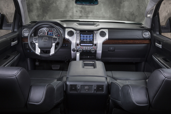
This is the new interior of the limited package. You can see the loss of the second glove box, the circular vents and the new dash. The center stack has been moved closer too.
The design philosophy for the new interior was as follows:
1. Have a modern design with a “true truck” look
2. Enhance ergonomics/technology offerings
3. Incorporate a grade strategy with each trim level to differentiate offerings
Also, a key note is that the Entune system is now standard throughout the lineup. Whether you like the system or not, you will now not have a choice. On the plus side, the center line of the Entune system and controls like AC has been moved 2.5 inches closer to the driver. This wasn’t a big deal on the older models and it didn’t really stand out to me. I should note as well I am 5′ 7″ and I have “average” length arms.
Another thing on the Entune is that they have really worked to make it more consumer friendly. You can now rearrange the icons and it has many features to split up the map, check in on Facebook or read Yelp reviews (both while you are stopped of course). For me, I had some difficulty rearranging the icons and have, frankly, never found the systems to be that great. I am often grabbing my iPhone well before I mess with them. Another interesting question, is how well do they work with gloves on? I didn’t have gloves with me, but based on my bare fingers, I’m not sold that it works that well AT ALL.

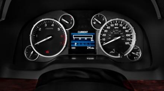
The instrument panel is MUCH easier to see.
The first thing to notice is the new instrument panel. While personal feelings will vary, it is a much easier display to read. Also, the amber color is gone and is now replaced with a white background. Even though, I didn’t get a chance to drive the truck at night, my guess is that it is much more pleasing to look at.
One of the other first things to notice about the interior is the new steering wheel. It feels different and response is different when driving. Also, they have added the four-way adjustable button and a few more buttons.
The seats have great stitching added to them and it really blends together with the panel on the glove box. The look blends together and it is really a premium package.
Another change is that the seats have been adjusted. Toyota says:
- + 0.79-in. increase in seat sliding range for both bench and bucket seats (8.27-in. to 9.06-in.)
- + 0.59-in.wider lifting range of seat height adjustment on front seats (1.77-in. to 2.36-in.)
- + 0.39-in. larger cushion length adjustment range on driver’s seat (1.20-in. to 1.59-in.)
Again, not a big deal for me, but I could see it having some value for taller or shorter individuals.
Now, they did do a cool thing with the cooling feature of the seats. The lower part pushes cool air into your legs while the upper “pulls” the hot air away. As anyone knows with a sweaty back, adding cool air to it keeps the moisture in place. But, pulling the air away, really cools the air and wicks the moisture away. A good touch.
My Gripes
There are several things on this package that I’m not a fan of. While, the look IS more American and any semblance between it and the Ford F-150 is purely intentional. Yes, intentional. That is my first issue, it really lost the unique look it used to have.
Other “new” features simply don’t work like the multi-informational display that sits the guages. Quite simply it is nearly impossible to see with daylight on it. There is also no brightness adjustment. This is terrible. I, literally, had to be stopped or pull over to now “cycle” to see the different information like fuel economy, fuel range and temperature.
Another item that bugged me is that there is no longer a quick read of time/temperature. The older model Tundra pickups (non-Entune) have a time/temperature display built into the dash along the top. This is gone and you will now need to “cycle” through the multi-informational display to find the temperature. Frankly, this is just a poor solution. While the clock has been moved to the top of the Entune display, it is small and can be tough to see (see: daylight issue). And it is worth noting, the temperature has not moved, say, next to the time. While some drivers don’t care about the temperature, I really liked it. Too bad, they didn’t add it to the rear-view mirror (like other makers) or put it somewhere on the Entune home display.
A small item I noticed is that on the 2013 model, there is a small tray behind the shifting knob. This tray is perfect for loose change and my cell phone. Frankly, I use that tray more than anything else. I tried to find another place for my cell phone and was unable to locate such a “sweet” spot. Not cool. Readers have pointed out that it does seem that the limited package has this tray, but not the platinum I drove. Odd. (Note: they did remove the map slot which helped move my drink closer. I think that is a win with lots of door storage for maps.)
Next, the driver side grab handle has been eliminated and this stinks! On the older Tundra pickups, I used this handle each and every time I stepped into the vehicle. When asked about this, the response was to use the steering wheel. That is just poor. The steering wheel shifts and moves. One time when entering the truck, it moved just right and I about lost my balance. Without running boards, I would have probably been looking up at the sky. Considering Toyota says they built the interior to fit a 5′ 6″ women, apparently they didn’t design it for her to get in. Point blank, without running boards, I am nervous about getting into this truck AND I get into a TON of trucks (not my first time).

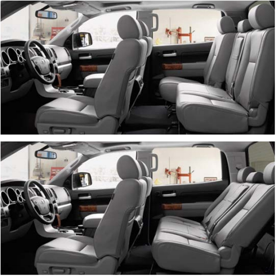
Ahh… looks like time for a nap. Now? No slide and recline and less leg room in the 2014 Tundra. See: deal, big.
Lastly, the obvious issue, is the lack of the slide and recline seats in the CrewMax. Their answer is of course, the flip up style seat which is in response to customer feedback that they couldn’t load items in the back of their truck. The example was a flat-screen TV. Not only would it be difficult to load with the old seats folding flat, but it wouldn’t really fit. Now wit the larger space and a lower entry level (down 11″), it would be easier to load such an item. I had a certain reply to the answer in mind, but I don’t like to cuss in a large room.
While the loss of slide and recline is a poor design choice with no storage underneath, the end result is less leg room. That’s right, less leg room. A detail that seemed to escape every other journalist, the rear leg room of the CrewMax is now 42.3 inches according to Toyota’s spec chart. The old, “class-leading” leg room was 44.5 inches. You think 2 inches doesn’t matter. Think again when hauling a crew of tall guys or kids. I noticed that I would not be able to put my kids in their car seats without leaving the rear seating area. Right now, I can buckle each kid in without having to enter and exit the vehicle for each one. That is a BIG deal to a parent and was completely overlooked.

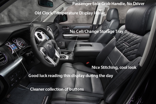
This picture really shows the “hit and miss” of the interior.
The interior really is a hit and miss for me. While I can certainly see the instrument panel as a big plus, the loss of functionality and storage throughout the cab is sad. It used to be a perfect mix for my family and this new model certainly has some shortcomings. Agreeably, some buyers/owners won’t care about that, but when you want to put your change somewhere, you will.
What’s your take? Is storage a big item or do you want more plastic and streamlined look?
Related Posts:
- 2014 Toyota Tundra Gained/Lost List – Media Preview Wrap
- 2014 Toyota Tundra Exterior – What They Were Thinking
Search terms people used to find this page:
- tundraheadquarters
- 2014 toyota tundra
Filed Under: TundraHeadquarters.com


Thanks for the write up. I’m a bit underwhelmed by the 2014 myself. Checked out a DC TRD 4X4 recently and was a bit disappointed.
Here are a few of my gripes.
1. My DC RW came with dual climate control (manual). The 2014 SR5 TRD DC doesn’t. Why?
2. Like you, I use the slot behind the shifter quite a bit. Now it’s gone. Why?
3. Not a fan of the Entunes system at all. Reminds me of the system Ford now uses, no thanks. Tried it and found it NOT user friendly.
4. Don’t care for the Ford style venting. I compared the Ford F150 I drove for work and my Tundra and felt the Tundra cooled/heated the cab quicker and more efficiently with less noise than our F150. I feel this is a step backwards for Toyota.
Overall, I feel they tried too hard to emulate the interior of Ford’s trucks, especially the F150. I do like the new gauge cluster however. The tunnel gauges didn’t quite cut it IMO as well as the amber/red back lighting.
I seriously considered trading in my current RW but now have decided to keep it. For myself, the changes are not quite enough to justify a trade-in so soon.
Did you try increasing the brightness of the entune system and the dash display? I think the default is half brightness, that might help.
The first interior picture you have is of the limited crewmax, not the platinum as the caption states.
The 2014 tundra brochure shows that little tray behind the shifter on the limited. I’m getting a limited and I hope the final model has it.
On the entune app, you can customize it to show time and weather on the home screen. Still no dash display :(.
How did they lose 2 inches to the back seat? Are the seats bigger? I thought they had the same cabin. Is it because of the wider sliding range? So maybe you don’t lose room at all unless you slide back all the way?
Nate,
First,thanks for pointing out my error on the photo. My only excuse is that I was knocking out a bunch of articles at once and trying to unload all my ideas. My fault. I have adjusted it. Also, sadly, I can’t find a good picture of the Platinum interior and my photos stink. 🙂
On the brightness for the Multi-Informational Display. A few of my colleagues and the Toyota reps looked for a way to improve the brightness of just that display. We were unable too. And due to time restraints, I didn’t get a chance to look through the manual. As this is my “first take,” I am hopeful to get a 2014 press vehicle and dig into this. If you get any more details on it, let me know.
Oh yeah, before I forget, congrats on your new truck!!
The legroom is simply a byproduct of the seats being at a “reclined” position permanently. If I were to recline my seats in the CM, I would have the same legroom as the 2014. But, with my boys car seats, they are in the vertical position giving me the 2 inches back.
I’ll take your word for the entune app. I briefly played around with it, got annoyed and then moved on.
All in all, like I said above, I am really hoping for a longer term review of it when I get a press vehicle. For now, this was my first take.
Thanks for commenting.
-Tim
No new truck for me yet, I’m waiting for them to get it in :).
I JUST went down to the dealer and sat in a 2014 Platinum. Boy, that has a nice inside.
One thing that I tried out that I’ve heard bad stuff about is the ventilated seats. I know they are supposed to be improved this year. I’m wearing shorts and I thought it was pretty nice.
LOL! I’ll be curious what you think. I tried those ventilated seats too. They are great!
-Tim
Just checked a walk through video for the sr5. Cell phone tray behind the shifter is there. http://youtu.be/C4t9M6pQ9b4
Nate,
Yep I see it. I amended my article to point out what you said. Thanks for the feedback.
-Tim
I don’t see an issue on what you don’t like Tim. Very seldom I grab the handle on the driver’s side. When I bought this 07 the first thing the wife said get the nerf bars now. I use the nerf bar to step in. As for that tray I don’t use it much but it grabs the dirt all the time. The one I do agree upon is the temp and time on top. I use the temp quite often. Just to see how hot or cold it is. The clock is used also simply on driving trips to see what time even though I have a watch. It just makes it simple to have that feature. It’s not a deal breaker for me.
I wouldn’t say anything is a deal breaker, more of a gripe.
Tim
I don’t touch the grab handle either. However, my wife is 5’3″ and uses it and the running boards to get in to our 4runner. (that is a bit lower)
Wait a sec, if I get a new truck, and she can’t get in, she can’t drive it. Thanks Toyota, I never knew you were so devious.
BTW, with a name like “Go Big” I don’t expect you to have to use the grab handle. 🙂
-Tim
Now I’m confused. In many of the photos there is no driver’s side grab handle, yet on some of the youtube walk through videos, there is a grab handle. Does that differ depending on trim level?
never mind. The video was mislabeled. They were showing a 2013 interior, thus explaining the handle.
Tim,
Thanks for the quick review.
As strange as this may sound; the clock and temp is the biggest to me. I know you can toggle on the center display for temp, but I had prefer the clock and temp together somewhere on the dash at “all” times. I hope the Entune panel is easy to see in all conditions? I did not pay it any attention to it in my quick test drive. I hope the Entune is not the same low quality as the Ford Sync; its real buggie and you have to jump through hoops to make it work.
Yep, the Kids; been there done that, space is valuable, but I do remember the car seats. Glad I am well past that stage.
Hi Tim.
Thanks for the legit review.
Have a question.
Can you put anything behind the crewmax seats?
If no then where is the tools compartment (winch). I use that opening a lot for small staff, first aid kit, etc. Also I use to stick construction plans, some clothes and some fragile staff behind the back seat so they stay in place protected. And you can still have a crew comfortably inside.
Lifting the seats to make it like a van seems plain stupid too me. I am not sure if anybody hauls flat screen tvs on a daily basis but when I bought mine it came in a box and we had just placed in the bed.
I actually like that they removed that small tray on platinum. Dust collector to me. I put my phone in the door pocket (top one above the armrest or whatever you call it).
Hi Yury,
I tried to find a way to lean the back of the seat forward and was unable too. Granted I didn’t have a whole lot of time to look, like 1-2 minutes. I am then, guessing that no there is no way to lean that seat forward and put storage behind it. Like I have said, I think this is a big mistake on Toyota’s part.
And yes, I ABSOLUTELY agree with your statement on carrying a TV. I just don’t see how the fold-up seats w/o storage is in any way an improvement over previous gen models.
Thanks for commenting.
-Tim
gee, seems like you totally dislike the interior and I would agree 110%.
I liked the arrangement of the interior except the driver seat and track of ALL 2007 thru 2013 tundras are junk. Hoping the seats are better in 2014 but other than that, all is a downgrade as far as I am concerned.
NO clock, no outside temp, no storage, no 2nd glove box.
Heck, does it have 3 cupholders in the middle?
Sounds like you don’t get door storage pockets that have cupholder inserts in either, or does it? If it doesn’t have all 4 doors having storage pockets down low in the door panels inside NOT going to buy it use that space for a lot of crap on trips for storage. It is a truck for gosh sakes, need storage and this interior sucks for that.
Sort of leaning now towards back to chevy silverado for 2014 but went and looked at one and NO rebates and seats are rough, ugly fabric, not plush and nice looking.
As far as Entune, it is junk and just asking for more trouble just like ford’s sync system is garbage. You even said cannot read it and the dash info system in daylight, so why even bother?
MK,
Hmm… Didn’t think of my review as totally disliking it, but I guess you are right as I reread it. I really didn’t find any of the “new” features that great except for the seat cooling feature. The dash is better, but with the display being impossible to read, it is a big disappointment.
My main gripe is the poor choice in removing the slide and recline seats. I, honestly, could live with everything else. That is a deal breaker.
-Tim
I can deal with temp guage and clock gone from on top. I for one will tell Toyota to ram etune stuff. I could care less for that type of things. If it has a Nav it better be updated to 2014. This crap of giving a Nav and it’s 4 years old don’t get it for me. My wife got that with her 07 Prius. She got a Nav that was 3 years old and if you wanted an 07 update they wanted another $500. The lowest I will go is a 2013 map. Anything lower they can rip that nav out and jam it. I don’t use etune to get my music or use my laptop. I have XM for music and I use an AT&T wifi to use my Kindle Fire and Laptop to get internet. In fact this past weekend we went to Charleston, SC and Charlotte, NC. We went to Nascar Hall Of Fame was great but went to individual shops were closed on Saturday. With her laptop she picked out going back to Savannah and we had a great time there on Sunday coming home on Monday.
Thanks for the write up. I didn’t notice the 2nd glove box was missing on 2014s.
From my roadtest in bright sunlight I found the dash very hard to read (silvery grey on black is not a strong contrast).
To me the very best dash is 2013 limited or platinum, gauges have strong contrast.
The dash clock/temp missing is one of two deal breakers on the 2014 for me. The other is no storage behind back seat.
For the person looking at the Silverado, pay attention to the back seat…no rear a/c vent, you have to rely on the dash vents for rear seat! That’s a big cabin to not have some direct rear a/c.
I am really shocked if the loading of an lcd tv is the reason for the rear seat change in the 2014. Every flat panel tv I have ever seen says “do not lay flat” on the box…it can actually damage it to do so! This is from best buy’s website:
Larger LCD and LED TVs are constructed to have their weight balanced when set upright. So if you lay the screen flat, there won’t be adequate support in the middle, which can lead to cracking or distortion on the edges if left that way over time. Add in the vibrations while driving a car, and the chance of cracking or distortion only increases.
So, if that is truly Toyota’s reason, it is truly a bizarre choice.
Anyway I am going to buy the 2013 because of the clock and rear seat issues.
John,
Glad I am not the only one who couldn’t see the dash! I was getting concerned.
Frankly, I agree with all your other points. I bought a 2013 as well instead of the 2014.
-Tim
Tim, I wish i would have read you article sooner. I traded in a 2005 Tundra for a new 2014 crew max and I’m very disappointed in the lack of storage in the 14′ Tundra. No storage under or behind the back seat. The rear seat only folds up and not down. I always heard of the nice reclining rear seat in the new crew max only to get it home to find that the 2014 doesn’t recline. WTH!!! Come on, I just spent $35k for a new vehicle only to find it doesn’t have a feature that everyone bragged about in prior models. I just kick myself for not checking this out first.
The center console has very limited storage around the cup holders then a bottomless pit under the armrest. How about a tray or a double pull up arm rest with small storage? The glove box is extremly small. My old 2005 crew max had twice the storage. Come on Toyota you’ve taken a step backwards on the new interior. Toyota used to be the leader in little nickle and dime cool stuff. Now they just want to follow the others. No Extras.
Well, you can’t blame me for not trying to warn you! LOL. Yes, for those who want/need storage in a truck, the 2014 model is woefully short. I will say that in my 2013, I don’t use the storage nearly as much as I thought I would. Nor, do I use the slide and recline rear seats that much (my kids are still in car seats).
It is a trade off for sure, I do like the gauges and the improvement in ride quality/handling on-center steering.
-Tim